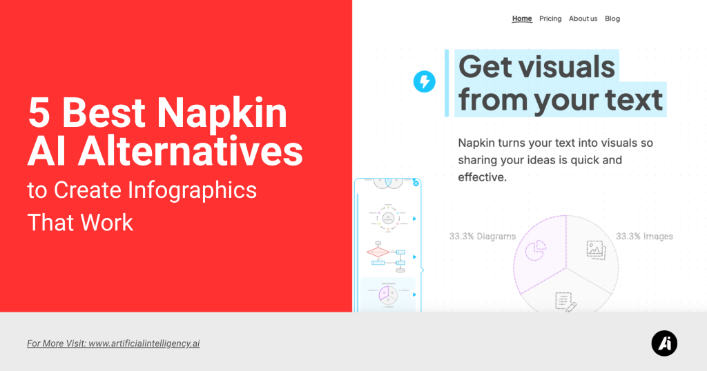
Napkin AI started out very productive and efficient. You drop an idea, and it gives you those mind map visuals that feel easy to build on. It’s clean. It’s not bloated. It gets out of the way when you want to sketch out a plan or lay down the bones of a talk.
We’ve also covered a full Napkin AI review if you want a deeper dive into what it gets right—and where it stalls.
But here’s the thing.
At some point, the simplicity turns into a wall. You try exporting, and all you get is a static image. You can’t make it look polished without bouncing into PowerPoint or Google Slides anyway.
You try to edit the structure, but it just becomes more clicks. There are no animations. No formatting help. No way to make it feel like an actual deck unless you’re screenshotting.
So here we are.
Looking for tools that keep that speed and simplicity but do more. Real presentation output. Real formatting control. Tools that fit the way people work in 2025.
I went through everything I could get my hands on that fills in the gaps Napkin leaves behind. Some focus on building slides from documents. Some let you present in new formats. Some are just better at helping you think visually without getting boxed in.
Let’s start with five solid picks you might want to switch to. Ket’s begin..
Why Ditch Napkin AI
Napkin AI made it easy to sketch out ideas and rough concepts. But if you have found yourself wrestling with static images, lost formatting when you export, or spending more time on workarounds than on crafting your story, it might be time to look elsewhere.
These alternatives offer true slide decks, live collaboration, advanced branding controls, and interactive elements that Napkin cannot deliver yet.
Moving on does not mean abandoning familiar workflows—it means gaining new capabilities to match how you present in 2025.
1. Microsoft Copilot for PowerPoint

Microsoft Copilot for PowerPoint feels like having an assistant in the very ribbon you already know. You type in an outline or paste in notes, and it builds slides with titles, summary bullets, and speaker prompts all in place.
There is no juggling between windows or copy-pasting text into separate apps. It leans on the rest of your Office environment, so tables from Word or charts from Excel flow right into the deck.
The system even suggests layout tweaks based on best practices without sending you down a rigid path. You still choose colors or images, but the heavy lifting of slide structure and base content is handled by AI.
It is most useful when you need to go from a rough draft to a ready presentation in minutes rather than hours. If your work lives inside Microsoft 365, this tool fits neatly into your routine.
Key Features
→ Creates complete slide decks from natural language prompts
→ Offers slide-by-slide layout recommendations
→ Generates speaker notes automatically
→ Native integration within the PowerPoint interface
Use Case
You’re part of a sales enablement team supporting multiple account executives. Each prospect needs a customized pitch deck that pulls from shared collateral, vertical-specific value props, and recent customer data.
With Microsoft Copilot, you feed in a structured prompt like “Build a deck for a mid-size retail client focused on cost reduction and AI integration,” and Copilot creates a presentation using your existing templates, product messaging, and Excel-based ROI tables.
Instead of recreating decks manually, you use the AI to spin up tailored, ready-to-present slides for each sales call, complete with speaker notes and chart layouts based on real-time data pulled from other Office apps.
Why This Matters:
This workflow is ideal for sales operations and business development teams that need to scale personalization without compromising speed or consistency. It allows faster deal cycles and ensures messaging remains on-brand across all touchpoints.
Pros
→ No learning curve beyond PowerPoint basics
→ Professional clean formatting by default
→ Leverages the existing Office ecosystem
Cons
→ Limited to the Microsoft PowerPoint environment
→ Creative layouts remain basic
→ Requires a Copilot license on top of the existing subscription
Pricing
The Copilot add‑on on top of a Microsoft 365 business subscription typically starts at twelve dollars per user per month, with enterprise plans varying by seat count.
2. Piktochart

Piktochart makes it simple to turn data or ideas into eye-catching visuals without needing design skills. You begin with a blank canvas or one of many templates for infographics reports or presentations. Drag and drop chart icons, images, or text boxes onto your canvas.
The AI features can suggest layouts or generate visuals from data you upload in a spreadsheet. Once your design is ready, you share a view link, embed it on a webpage, or export as a high-resolution image PDF, or an editable PowerPoint file.
This workflow shines when you need to communicate findings clearly to non-technical stakeholders or when your team wants on-brand visuals fast without waiting on a designer.
You retain full control over colours, fonts, and graphic placement, yet benefit from smart suggestions that speed up decision making and keep everything aligned.
Key Features
→ Template library for infographics presentations and reports
→ Drag and drop chart builder with spreadsheet import
→ AI-assisted layout suggestions and visual generation
→ High resolution export to PDF image or PowerPoint
→ Brand kit support for colours, fonts, and logos
Use Case
You’re a healthcare analyst preparing a report for a public-facing health initiative. You’ve collected complex datasets on vaccination rates and demographic reach.
Instead of handing over a spreadsheet or a dense Word doc, you use Piktochart to translate your findings into an easy-to-understand visual summary—with comparison charts, infographic elements, and contextual captions.
Piktochart’s AI assists in selecting the right chart types, adjusting spacing, and ensuring that colors and font sizes meet accessibility standards, which is crucial for government or nonprofit communication.
Why This Matters:
This is perfect for public policy professionals, educators, and nonprofit orgs who need to bridge the gap between data-heavy analysis and stakeholder comprehension. It boosts trust, improves decision-making, and ensures your data is seen and understood by the right people.
Pros
→ No design background required to produce professional visuals
→ Flexible export options including editable presentation files
→ Brand kit ensures consistency across all projects
Cons
→ Advanced customisation beyond templates can be limited
→ AI suggestions sometimes feel generic until you refine them manually
→ Free version restricts storage and download counts
Pricing
→ Free plan available at no cost with basic features and limited downloads
→ Pro plan costs fourteen dollars per month when billed annually or twenty-nine dollars per month when billed monthly
3. Prezi AI

Prezi AI throws out the slide-by-slide approach in favor of a zoomable canvas that moves you through ideas in a nonlinear flow. You provide a topic or an outline, and the AI maps out related concepts visually. It builds a storyboard that lets you pan from one idea to the next with fluid motion.
There is also a built-in recording feature so you can add narration and export a video-ready file in one go. The creative style shines in training sessions or client presentations where you want to surprise and delight.
It is not ideal for those who need a standard deck for formal board meetings. Instead, it meets the needs of workshop hosts, educators, and creative teams looking to craft an experience rather than just slides. Learning the canvas takes time, yet the payoff in audience engagement can be worth it.
Key Features
→ Zoomable interactive canvas
→ AI-driven story mapping from prompts
→ Built-in screen recording and video export
→ Import and export support for PowerPoint
Use Case
You’re a solopreneur or creator drafting a TED-style talk or podcast episode. You open Napkin AI to capture loose fragments: a theme, a quote, a statistic, a metaphor.
The tool organizes them into a mind map in real time, visually clustering ideas and drawing relational threads between subtopics.
Unlike linear tools, Napkin allows you to think non-sequentially—you can explore a concept from multiple angles, group similar arguments, and quickly see how an anecdote supports your central thesis. You’re not building a final deck here—you’re designing the narrative backbone.
Why This Matters:
This is particularly powerful for creatives, speakers, coaches, and writers who work best through spatial ideation. Napkin excels at turning chaos into clarity, especially in the early stages when traditional slide decks or scripts are too rigid.
Pros
→ Highly engaging motion-driven format
→ Storytelling focus helps retain attention
→ Works seamlessly with video conferencing tools
Cons
→ Steep learning curve for new users
→ Overuse of motion can overwhelm viewers
→ Not suited for traditional formal reports
Pricing
Individual plan costs fifteen dollars per month. Business tiers start at twenty five dollars per user per month and rise with seat count.
4. Lucidchart

Lucidchart turns complex ideas into clear diagrams without demanding a design background. You start on a blank canvas or select one of the many templates for flowcharts, mind maps, or network diagrams. Drag and drop shapes, connect them with lines, and add text or images.
The intelligent layout engine keeps everything aligned as you add or move elements. Real-time collaboration lets team members comment, edit, and build together in one place.
Integrations with tools like Google Drive, Microsoft Teams, and Slack mean you can embed your diagrams wherever your work happens. Whether you need to map a process for new hires, sketch a database schema, or plan a marketing campaign, Lucidchart adapts to your workflow.
It even offers offline mode so you can work on the go, then sync changes when you reconnect. With Lucidchart, you get both the power of advanced diagramming features and the ease of a tool built for anyone who needs to think visually.
Key Features
→ Blank canvas and extensive template library for diagrams
→ Intelligent layout engine that reflows connections automatically
→ Real-time collaboration with comments and shared editing
→ Offline mode with automatic syncing on reconnection
→ Integrations with Google Drive, Microsoft Teams, Slack, and more
Use Case
You’re a solutions architect leading a backend migration to microservices. You open Lucidchart to model a high-level architecture that includes API gateways, services, databases, and message queues.
As the dev team begins implementation, you update the diagram in real-time and tag team members on specific nodes to clarify dependencies or flag bottlenecks.
Later, the same diagram is embedded in Confluence and reviewed during Sprint Planning in Microsoft Teams. Since Lucidchart maintains version history and supports collaborative editing, your architecture stays living and version-controlled without switching tools.
Why This Matters:
Lucidchart is a go-to tool for technical professionals—engineers, DevOps, product managers- who need to visualize system logic clearly. It reduces the gap between technical planning and execution, supports collaborative problem-solving, and enhances documentation workflows across fast-moving teams.
Pros
→ Intuitive interface that scales from simple to complex diagrams
→ Strong collaboration features for remote and hybrid teams
→ Seamless integration with popular productivity apps
Cons
→ Free plan limits document count and shape usage
→ Advanced features require a paid subscription
→ Enterprise configuration and admin controls take time to set up
Pricing
→ Free plan at no cost with up to three editable documents and sixty shapes per document
→ Individual plan is nine dollars per user per month, billed annually, with unlimited documents and one gigabyte of storage
5. Beautiful AI

Beautiful AI makes slide design feel automatic yet refined. You pick a smart template, add your text, images, or data, and the layout adapts in real time to keep everything balanced and centered.
There is an icon and illustration library built in, so you can add visuals without hunting online. It also gives you analytics on slide engagement when you share links, so you know which parts resonate.
This tool fits marketing teams, small agencies, or solo entrepreneurs looking for polished decks without a designer on staff. The automated approach limits how much you can stray from the structure, yet it speeds up production massively.
If you need a quick deck that looks polished and you do not mind following template logic, this is a solid choice.
Key Features
→ Responsive smart templates that adapt to content
→ Integrated icon and illustration library
→ Automatic image placeholders that adjust sizing
→ Slide engagement analytics for shared presentations
Use Case
You’re a startup founder preparing a monthly update for investors. The content is ready—key metrics, new milestones, burn rate updates—but you don’t have the bandwidth to manually design slides.
With Beautiful.ai, you choose a “Pitch Update” smart template, input your numbers and commentary, and the system adjusts the layout to maintain design integrity across every slide.
You drag in a line chart to show MRR growth, and the chart automatically scales with matching fonts and spacing. You use brand colors via the custom theme builder, then share a presentation link that includes view tracking, so you know who viewed it and how long they spent on each section.
Why This Matters:
This is perfect for founders, executive assistants, or operations leads who need investor-ready decks that look custom-designed but can be produced in an hour. It removes the barrier of visual formatting and helps keep stakeholders aligned with visually engaging, fast-to-create updates.
Pros
→ Instant professional layouts
→ No design skills required
→ Insight into viewer engagement
Cons
→ Limited freedom outside template rules
→ Advanced customization is not available
→ Watermarks appear on free plan outputs
Pricing
The starter plan is twelve dollars per month per user. The Pro plan is twenty-eight dollars per month per user. Enterprise options available on contact.
Setting Up Your Workflow
Once you have chosen your preferred presentation tool, the next step is to streamline your process so every deck flows smoothly from idea to final share.
Start by installing any extensions or add‑ins the tool requires. Next, gather your brand assets, such as logos, color values, and approved fonts, and upload them into the brand kit section if available.
Decide whether you will begin each project from a blank canvas or by importing existing documents such as meeting notes, slide decks, or video transcripts.
Finally, establish a quick review loop with stakeholders so feedback comes early and often, avoiding last-minute overhauls.
| Step | Action | Details |
| Install Extensions | Add browser or Office plug-ins | Ensure you have the latest version of any required plug in and permit it to access files |
| Upload Brand Assets | Gather logos, fonts, and color guides | Place these into the tool’s brand kit so every slide adheres to your visual standards |
| Choose Import Method | Outline versus document import | Test both a blank start and a document import to see which gives you the fastest head start |
| Build a Sample Deck | Create three three-slide mockup | Use your top two tool choices to draft identical slides and compare editing ease |
| Establish Feedback Loop | Set calendar invites for early reviews | Share draft links with collaborators and collect comments before you polish the final version |
Why Try These Alternatives
Each of the seven tools we covered brings something unique to the table.
You might seek one for its narrative first approach, another for its deep Office integration, or one more for its visual storytelling canvas. Here are a few reasons to explore them:
→ You need native PowerPoint export with full editability
→ You want built‑in data visualization or brand kit support
→ You crave interactive elements or live polls in your deck
→ You prefer canvas-style navigation to linear slides
→ You are looking for AI that adapts to mixed inputs like video or transcripts
Picking up a new presentation app can feel daunting, but testing a couple of demos or free tiers takes only minutes.
Final Thoughts
You do not have to suffer through awkward exports or time wasted on cosmetic tweaks.
These seven Napkin AI alternatives provide end-to-end solutions for everyone from solo marketers to enterprise teams. Your presentations can stay as nimble as your ideas without compromise.
Spend less time fixing and more time telling the story you want to share.